Have you ever tried to plot multiple quantities on one graph, only to realize that the scales don’t match up? You can solve this problem by adding a second y-axis to your 1D plot to include two scales of values. In the video below, we introduce a case where you would want two y-axes. We then show you how to add a second y-axis to your graph and create helpful annotations in the COMSOL Multiphysics® software.
Video: How to Create a Graph with Two Y-Axes in COMSOL Multiphysics®
Video Transcription
In COMSOL Multiphysics, you can plot two different quantities with different scales and units simultaneously on a 1D plot by adding a second y-axis to your plot group. In this video, we will introduce a case where this functionality is needed, add a second y-axis, and include a legend and annotations to complete the picture.
Model Overview
For this video, we have opened the Axisymmetric Transient Heat Transfer model from the Application Libraries. And you can open this as well by going to COMSOL Multiphysics>Heat Transfer and then selecting heat transient axi. This is a relatively simple heat transfer model in which a temperature of 0° is assigned to the entire domain and then we assign a boundary condition so that the boundaries are 1000°. As time passes, the heat transfers throughout the model and heats up the inner domain. Looking at how this model is set up, we’ve set an initial value of 0°C throughout this entire 2D domain. Next, this axial symmetry condition defines where the symmetry plane is defined, r = 0. And this is used for when we revolve the model. That’s how we get this puck. Finally, we add a temperature of 1000°C to the 3 boundaries on the outside of this rectangle. And then we run the study from 0 to 190 seconds, with a step size of 10 seconds. We have also created a Cut Point 2D. This is simply a point that we define — in this case, at 0.1 in the r direction and 0.3 in the z direction — and we can extract values from this point. We have used this cut point to extract the temperature value at 190 seconds.
Create 1D Plot Group
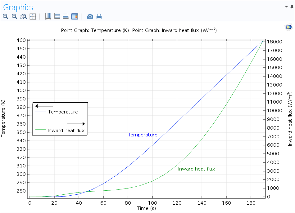
We can also create a graph from this cut point, showing all of the times from 0 to 190 seconds. Let’s go to the Results tab and add a 1D Plot Group. We can then add a Point Graph, select Cut Point 2D, extract the temperature as degrees Celsius, and click Plot. Here, you can see that 186° is the last value at 190 seconds and we can see how this model heats up from 0 to 190 seconds. Let’s name this Temperature. We can then add another Point Graph in which we would want to create another value to show. In this case, we’ll select Cut Point 2D again and select the heat flux. We will use the total heat flux in the r-component direction. And then we’ll enter negative for the expression. And this is defining the inward heat flux; that is, how the heat transfers from the right to the left or from the outer boundaries inward to the center of the domain. So we can name this Inward heat flux. And again, we can name the point graph Inward heat flux and plot this. You can see the heat flux, in green, going from 0 to over 18,000 watts per meter squared. You may also notice that the Temperature plot is still plotted on this graph the blue line down here at the bottom. Since the heat flux values are so high, they sort of drown out the lower temperature values.
Enable Two Y-Axes Plot
This is where we would want to create a second y-axis. Let’s go to our 1D plot group and select Two y-axes. We then need to select our plot that we want to add as the secondary y-axis and we’ll choose Inward heat flux. After we check this box, the graph automatically updates; We can see the Temperature scale on the left side and the Inward heat flux on the right side. We could also go into the Temperature node again and say maybe we want to change this unit from degrees Celsius to Kelvin. When we click Plot again, the graph automatically updates and we can see Kelvin on the left side.
Now, we’ve created this graph with two y-axes, but it’s a little difficult to tell which line goes with which axis. We can resolve this by adding legends. At the bottom of this Settings window, you can see that legends are already added. Therefore, we can go into the individual nodes and select to show the legend. We’ll need to rename this Temperature. And then in Inward heat flux, we can show the legend and rename this Heat flux. Here, you can see that the legend has been added with arrows pointing to the axis that the Temperature and Heat flux each correspond to and the color for the lines they each correspond to as well. Let’s just move this to a different position in the middle left so that we’re not blocking any of the information that we want to show.
Add Annotations
And finally, this is a pretty good picture, but it might not be clear, again, which line corresponds to which axis and value, so we can add annotations here. We can enter in Temperature for the first annotation; enter a position, which I already know we want to be 80 in the r direction and 350 in the z direction; and we can plot this. You can see it here. This point is a little distracting and doesn’t need to be there, so we’ll get rid of it and then change the color to Blue to match the line. We can do the same thing for the Heat flux: enter in our position, uncheck Show point, select Green, and plot this value. The green is a little off, so we’ll switch to a custom color and then select a more appropriate green from that list.
And that is how you create a plot with two y-axes. First, you need to add both of your graphs. Then, simply check the y-axis button and select which graph you want to show on the secondary y-axis. Finally, you can add a legend and annotations to help people visualize your graph better.
Additional Resources
- Learn more about how to use the postprocessing tools in COMSOL Multiphysics


Comments (2)
Ryan Barron
December 15, 2022Having the screen constantly rescaling/zooming in to the point of interest during the video makes this really difficult to watch. I would suggest just making it full screen and keeping it that fixed, most Comsol users have decent sized screens so would be much easier to follow.
Swanand Vijay Sardeshmukh
April 17, 2024how to get the secondary grid on?