
All life on Earth is coded through ribonucleic acid (RNA) or deoxyribonucleic acid (DNA), two closely related macromolecules. In a way, we can say that there is only one type of life on Earth.
Viruses are on the limit of what can be called life. They have RNA or DNA, but they cannot produce their own components, and they cannot reproduce outside another living cell.
In order to reproduce, a virus has to come in contact with a living cell, it has to fit in the host cell’s receptors, and it has to open the host cell’s membrane. The virus can then inject its RNA or DNA and hijack the host cell’s metabolism to produce new virus particles.
Since a virus particle has a very limited ability to survive outside a living cell, the main mechanism for its spreading is through contact between living organisms. In the case of SARS-CoV-2, the virus responsible for the novel coronavirus disease, COVID-19, it has to be transmitted from human to human, directly or indirectly. COVID-19 has been classified as a pandemic by the World Health Organization (WHO).
But is it possible to understand the progress of the pandemic? How many will be infected? How many could die? Let us see what such models could look like.
Mathematical Models for COVID-19
One of the simplest models that is reasonably predictive for human-to-human transmission is the so-called SEIR model, which was published in its first form around the 1920s (Ref. 1, “The SIR model and the Foundations of Public Health“). It divides the population during an epidemic into four different compartments with different variables for the number of individuals in each compartment:
S = susceptible
E = exposed
I = infectious
R = recovered and immune
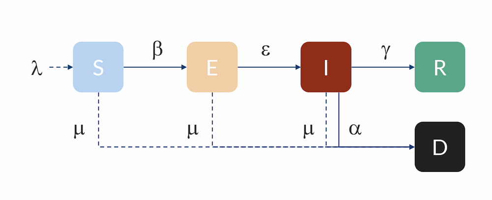
Compartmental model: Individuals flow from the S to the E compartment with a rate β, from E to I with a rate ε, and from I to R with a rate γ. Individuals can also flow from I to D (dead) with a rate α. Individuals in R are here assumed to be immune and do not return to S for the duration of the model. The inflow of newborns is represented by λ, while the natural death rate is represented by μ.
The unit for the S, E, I, and R variables is in number of individuals. In order for an individual in the susceptible compartment to be exposed, it has to have some kind of contact with an infected person. The probability for such an exposure is related to the product of the fraction of infected people times the number of susceptible people in a population. After some rearrangement, the rate of exposure is therefore:
(1)
where β is the transmission rate.
β (unit: 1/day) is related to the number of individuals that an infectious individual in turn infects on average, R0, and the average number of days that a person is infectious (before they are isolated or self-isolate), nid:
(2)
R0 is referred to as the basic reproduction number (dimensionless) and describes the spread of the disease when every contact an infected has is with a susceptible person (when there is no immunity at all in the population) before that person recovers. Any mitigation or containment strategy will aim to reduce the reproduction number, either by decreasing the transmission rate β or the time before infectious individuals are isolated.
For shorter (nonseasonal) epidemic simulations, we can assume a constant population in which natural deaths and births are in balance. Then the number of susceptible individuals decreases with the increase of new exposed cases, where N denotes the size of the population:
(3)
Correspondingly, the term on the right-hand side in the equation above is a source term in the equations for the number of exposed, E. However, this equation also has a negative term for those exposed that leave the E compartment and become infectious.
(4)
Here, ε denotes the rate of progression to infectious once exposed, in the unit per day (1/day). The rate is inversely proportional to the length of the incubation period.
The number of infectious, I, increases with εE per day but decreases with the rate at which individuals are isolated, recover, or die. Let the rate coefficient γ denote the rate at which people are isolated or recover. The rate is inversely proportional to the number of days they are infecting according to:
(5)
There is also a term for the rate at which infected die of the disease αI, and the equation for the infected variable, I, thus becomes:
(6)
The equation for the R variable, representing individuals that are no longer susceptible, is:
(7)
The equation for the number of individuals that die, D, is the following:
(8)
Flattening the Curve
We can start by looking at a simpler model, where the variable for exposed is not accounted for; i.e., susceptible individuals meet an infected individual and become infected. In our model, that would correspond to a very large value of ε. We can then compare it with Michael Höhle’s blog post, since he has solved the same equations (Ref. 2, “Flatten the COVID-19 curve“). The input data is the following:
N = 1 million individuals
R0 = 2.25, basic reproduction number
nid = 5 days
Finally, we need initial conditions:
S0 = N – I0 susceptible individuals
I0 = 10 infected individuals
In a first case, Höhle runs a simulation where the epidemic is allowed to progress without restrictions in social distancing in the population. In a second case, Höhle assumes that the authorities in the city of 1 million people take actions to reduce the reproduction number, for example by not allowing the gathering of larger groups of people (sports events, concerts, and so on). The first step is to reduce the basic reproduction number, after 28 days of the epidemic, down to 1.35, by introducing restrictions in social interaction. This reduction is sustained for five weeks, when the actions are relaxed, and the reproduction factor is then allowed to increase again to 1.8. The figure below shows the two cases: case 1 (no actions) and case 2 (reductions of R0). We can see excellent agreement with Höhle’s results.

The two cases as defined by Höhle. The results obtained here are in very good agreement with Höhle’s results. The actions taken to reduce the reproduction number are seen as a sudden decrease in new cases in the green curve after 28 days followed by a sudden increase.
The interesting conclusion from case 2 (by Höhle) is that actions taken to reduce the reproduction of new cases not only reduces the number of new cases at any given time, but it also reduces the number of people that get infected before the epidemic dies out. The results are shown in the figure below. The part of the population that gets infected before the epidemic dies out in case 1 is 85%, whereas in case 2 it is only 68%. So, actions do not only momentarily reduce the load on the healthcare system but they also reduce the total number of patients over the whole epidemic.

The fraction of the population that gets infected if no actions are taken is 85%, which can be seen in the recovery curve (red, solid). While in the case where actions are taken, 68% get infected (red, dashed).
Accounting for Distribution in a Population During the Progression of the Epidemic
For Hubei, Sweden, and the U.S., we can use a slightly more advanced model, a so-called Erlang–SEIR model (Ref. 3, “Discrete Stochastic Analogs of Erlang Epidemic Models“). By dividing the E and I compartments into subcompartments, the residence time for individuals in each compartment will follow an Erlang distribution with a specified mean residence time that is proportional to the number of subcompartments, kE and kI, and inversely proportional to the rate of transfer between subcompartments, ε and γ. This model can account for the fact that there is a distribution in the flow between the different compartments, for example, due to exposed cases entering at different times in different parts of the country. Increasing the number of subcompartments concentrates the distribution around the mean, effectively introducing a delay in the progress from E to I and from I to R and D.
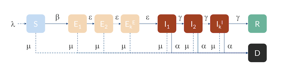
The Erlang–SEIR model with subcompartments for E and I.
China Locks Down
We can use this model and run a parameter estimation to data available for Hubei, where the epidemic started. We know that the number of infected individuals is not reliable data, since the majority of individuals are not tested or given a COVID-19 diagnosis (Ref. 4, “Estimates of the severity of coronavirus disease 2019: a model-based analysis“). The most reliable data is probably the number of deaths.
Assuming a mortality ratio of 0.66% (Ref. 4), a mean time as infectious before isolation of 3 days, and a time from onset of symptoms to death of 18 days on average, we can fit the start of the epidemic, the transmission rate, and the mean time in the exposed state in the Erlang distribution to the reported data from Hubei.
On January 22, the authorities implemented a lockdown and at the end of that month, measurements show an apparent decline in the basic reproduction number (Ref. 5, “Early dynamics of transmission and control of COVID-19: a mathematical modelling study“).
If we implement such a reduction, and if we fit the impact of that reduction with onset January 23, we get the results below.

The modeled data for the number of deaths compared to the data reported in Hubei. We can see that the model is in good agreement with data, with a small shift of a half a day to a day. This shift could be explained by a delay in reporting as the number of deaths increase. The smaller graph shows the same data in a logarithmic scale for the y-axis.
We can see in the graph above that the number of accumulated deaths shows an exponential growth, linear in the logarithmic plot, until around 400 deaths, by February 2. After February 3, the rate of increase in the number of deaths decreases so that the growth is no longer exponential. This is due to the restrictions in social contact. The impact of immune cases, which would also limit the reproduction number of COVID-19, is not yet seen at this stage.
The graph below shows the development of the epidemic in the number of exposed cases, infectious cases, recovered cases, and deaths. We have inserted extra grid lines at January 23, when the actions were implemented; midday of January 26, when the maximum number of infectious individuals occurred; and February 3, when the maximum number of individuals in critical state occurred. Note that the number of recovered cases refers to the cases that are no longer infectious and that are recovering. In the hospital, such patients were not to be released until one to two weeks later.

The development of the epidemic in Hubei. The predicted number of infected individuals over time is close to 500,000 people, which is more than 7 times higher than reported confirmed cases.
If we further look at the recovered cases, we can see that the model predicts almost 500,000 people that either are or have been infected by the virus after 90 days of the epidemic. This is more than 7 times more than the confirmed cases. It is also in line with other investigations, since only around 15% of the infected cases in Wuhan were registered (Ref. 6, “Substantial undocumented infection facilitates the rapid dissemination of novel coronavirus (SARS-CoV2)“) and since many infected individuals either do not report their symptoms or are not tested for COVID-19.
The basic reproduction number obtained from parameter estimation to Hubei data is 3.03, which is higher than reported by WHO but well within the range reported in other studies (Ref. 7, “The reproductive number of COVID-19 is higher compared to SARS coronavirus“). The social distancing reduced the reproduction number down to about 0.56, which we obtained by fitting to the death curves. This number is lower than reported elsewhere but consistent with the quick dying out of the local epidemic.
Swedes Keep Distance from Each Other
Sweden has chosen a different strategy than Hubei and most other countries: There are restrictions in social interactions, but it is very far from a complete lockdown like the one implemented in Hubei. So, modeling is slightly different than for Hubei, and also since the first infected and exposed cases were imported from Italy and Austria. We used a distribution of incoming cases related to the winter holidays, which are distributed over three weeks in different parts of the country. However, the majority of the travelers were likely exposed to the exponentially growing Italian outbreak during the two weeks between February 17 and March 1, when residents in the Stockholm area returned home.
Below are the number of simulated deaths compared to the reported deaths. The growth of cases is still exponential on April 2 (linear in the logarithmic graph).

The number of deaths due to COVID-19 in Sweden. The last reported value on day 33 corresponds to April 2. The smaller graph shows the same data in a logarithmic scale for the y-axis.
The basic reproduction number obtained from the parameter estimation to Swedish data is 2.95, which is consistent with that obtained for Hubei (3.03). The total number of import cases is estimated to be around 500.
Restrictions in social interactions have been in effect since around March 16, but they were mostly in the form of recommendations that likely did not have an immediate effect, so the impact is not yet seen in the number of deaths. We assumed in this model that the restrictions were in full effect March 20.
Let us assume two scenarios: a first scenario where the reduction in social interaction is reduced with a factor of 0.35 and a second scenario where this reduction is 0.30. The first case reduces the reproduction number down to 1.03; i.e., each infected infects 1.03 individual on average. The second case reduces the reproduction factor to 0.88, which is below 1, implying that out of ten infected, only nine (almost) can “replace” themselves before recovering (on average).
The reductions are in both cases less dramatic than the restrictions in Hubei, which is a reasonable assumption since Sweden has not implemented a complete lockdown.
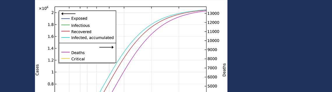
In the first scenario, about 2.1 million people are infected, or roughly 20% of the population (see the figure below). The number of people that are infected or that have been infected as of April 2 would be 280,000 people, almost 60 times the confirmed cases. The second case scenario results in around 260,000 people infected as of April 2, but the progress of the epidemic is substantially slowed down and impeded, resulting in just below 1 million people that at some time are infected by the virus, before the epidemic dies out.

Total number of infected, accumulated, in the two case scenarios in Sweden. This is the sum of all individuals that will be infected during the whole progress of the epidemic.
The final number of deaths in the first scenario is more than 13,000. Also, the peak in the number of critically ill and daily deaths is reached on April 21, shown in the figure below, and the number of deaths per day would peak at 155 cases per day. The second scenario results in about 6,500 deaths and a peak in number of deaths around April 15, with about 115 deaths per day.

The projected development of the epidemic in Sweden, accounting for the actions taken around March 12–16, assuming that the effects of the actions taken by the authorities are less efficient than the ones taken in Hubei.

The number of deaths in Sweden would peak around April 27, in case 1, and around April 15, in case 2.
Bringing down the reproduction number to 0.88, compared to 1.03, makes a dramatic difference, with only a slight difference in social distancing. This would still result in almost 6,500 deaths in Sweden before the epidemic dies out.
The United States in Quarantine
In our little investigation, the number of infected individuals and their inflow to the U.S. is a fitting parameter, assuming a distribution of infected cases from abroad. The parameter estimation is done using the death data until March 31. A problem specific to the U.S. is that there are larger regional differences in the progression of the epidemic, compared to Sweden and Hubei, and that different actions were taken at different times in different states.
The figure below shows the simulated and reported deaths as of March 31, day 31 in the graph. Also, in this case, we see an exponential growth of the number of deaths, corresponding to a linear increase on the logarithmic graph.

Simulated and reported number of deaths in the U.S. as of March 31. Note that in the logarithmic plot, the deviations between the model and the reported cases at small values of deaths look larger than at larger numbers. The smaller graph shows the same data in a logarithmic scale for the y-axis.
The basic reproduction number obtained from parameter estimation to U.S. data is 2.97, which is consistent with the values fitted for Sweden (2.95) and Hubei (3.03). The total number of imported cases would then be about 8000.
Also in the U.S., we can assume two scenarios: one that reduces the social interaction with a factor of 0.3, similar to the Swedish case, and a second case that reduces the level of interaction down to Hubei’s case above, 0.185. This is also reasonable, since the U.S. has imposed restrictions that are in between Sweden and Hubei; i.e., not a complete lockdown, but with tougher restrictions than Sweden regarding social interaction. This gives reproduction numbers of 0.89 and 0.55, respectively.
The first scenario predicts almost 20 million Americans infected before the epidemic dies out (see the figure below). The number of infected people as of April 1 would be 6 million. In the second case, around 5 million would have been infected. This is about 25 times the reported confirmed cases, which again sounds like a high, but not unlikely, number, since only a small fraction of the population is tested.

Total number of infected, accumulated, in the two case scenarios in the U.S. This is the sum of all individuals that will be infected during the whole progress of the epidemic.
The number of deaths in the U.S. would be 115,000 in the first scenario (see the figure below). The maximum in infectious individuals would have been around March 24. The peak in number of critical cases in intensive care would be on April 9. In the second case, with the same restrictions as Hubei, the number of patients in intensive care would peak around April 1. The number of deaths before the epidemic dies out would be around 33,000.

Exposed, infectious, critical, and deaths for the two case scenarios, one with a reduction of reproduction number down to 0.89 (case 1), and a second with a reduction down to 0.55 (case 2).

The number of deaths in the U.S. would peak around April 15, in case 1, and around April 9, in case 2, according to our model.
The deaths per day would peak around April 15, in case 1, and around April 9, in case 2. This would correspond to just below 1900 or 1300 deaths per day in the two cases, respectively. We can see that case 1 gives a much larger period with a higher number of deaths per day. And the numbers can quickly get worse. If we reduce the reproduction number to 1.04 (by a factor 0.35) — i.e., only just above case 1 above — then we are looking at 350,000 deaths before the epidemic is over. The model clearly shows the large impact of social distancing, not only in the number of people in critical state per day of the epidemic but also the total number of infected individuals is substantially smaller before the epidemic dies out.
What Happens When a New Outbreak Occurs?
The problem with imposing hard restrictions, quickly extinguishing the epidemic, is that the population is still highly susceptible to the virus. If new infected cases arise, then only a small fraction of the population is immune, and the epidemic will again progress with exponential growth in the second outbreak. This means that such a society must be prepared to very quickly take actions against a new outbreak. Imposing less restrictions gives a higher number of deaths in a first outbreak, but it makes a larger portion of the population immune, making such a population less vulnerable for the next outbreak. If such strategy is implemented, it is important to protect the parts of the population that risk a higher mortality, for example, elderly people. In a second outbreak, these people would be protected by a buffer of immune individuals.
How to Use the Models
The results presented here should not be interpreted as predictions. They are results from models that are simplifications of reality. We do not account for demographics in the populations. For example, age distribution in a population has a large impact on mortality of the disease.
Geographical variations within the studied countries where the progress of the epidemic is at different stages is not accounted for in an accurate way either. How people travel between different parts of a country also impacts the progress of the epidemic.
In addition, it is very difficult for us to predict the impact of the actions taken by the people of China, Sweden, and the U.S. on the input to the models. Governmental organizations such as the Chinese Center for Disease Control and Prevention, the Public Health Agency of Sweden, and the Center for Disease Control (CDC) in the U.S., have more sophisticated models that account for age distribution, location where the epidemic occurs, data for transport between cities, transport in and out of a country, and other demographic data. They also have better data about the virus and the disease itself, such as incubation time and reproduction numbers at different conditions and age distributions.
However, it is still interesting to use the models presented here. They give an understanding of the dynamics of the epidemic. The models also give an intuition of how important it is to reduce the reproduction number of COVID-19 by keeping social distance and avoiding unnecessary social interaction, to reduce the peak of infected patients in intensive care and to reduce the total impact of the epidemic. In addition, the Erlang–SEIR model is an important component and building block in more sophisticated models for cities and countries developed by national and international institutions involved in public health.
Download the Model and App Files
Download the SEIR Model for the COVID-19 Epidemic model and demo application via the button below.
References
- H. Weiss, “The SIR model and the Foundations of Public Health”, MATerials MATemàtics, vol. 2013, no. 3, pp. 1–17, 2013.
- M. Höhle, “Flatten the COVID-19 curve”, Theory meets practice…, 2020.
- W.M. Getz and E.R. Dougherty, “Discrete Stochastic Analogs of Erlang Epidemic Models”, Journal of Biological Dynamics, vol. 12, pp.16–38, 2018.
- R. Verity, L.C. Okell, I. Dorigatti, P. Winskill, C. Whittaker, et al., “Estimates of the severity of coronavirus disease 2019: a model-based analysis”, The Lancet Infectious Diseases, 2020.
- A.J. Kucharski, T.W. Russell, C. Diamond, Y. Liu, J. Edmunds, S. Funk, R.M. Eggo, “Early dynamics of transmission and control of COVID-19: a mathematical modelling study”, The Lancet Infectious Diseases, 2020.
- R. Li, S. Pei, B. Chen, et at., “Substantial undocumented infection facilitates the rapid dissemination of novel coronavirus (SARS-CoV2)”, Science, 2020.
- Y. Liu, A.A. Gayle, A. Wilder-Smith, and J. Rocklöv, “The reproductive number of COVID-19 is higher compared to SARS coronavirus”, Journal of Travel Medicine, vol. 27, no. 2, 2020.
Note that this is not a peer-reviewed publication, and it has not been prepared by or in consultation with any epidemiologist or in accordance with any epidemiological standards. Furthermore, a wide variety of circumstances that are not known may impact the accuracy of the model discussed, particularly with respect to future progression.


Comments (6)
Kenneth HANSRAJ
April 7, 2020Hey Ed
I do love your thinking!
Really out of the box.
Please contact me at any time, I would love to work with you on a project.
Steven Taitinger
April 13, 2020There is a pretty important gross assumption on one of the conclusive statements in this article. “So, actions do not only momentarily reduce the load on the healthcare system but they also reduce the total number of patients over the whole epidemic.” This is assuming that the epidemic is over after one wave and that the disease could be completely eradicated by social distancing. We live in a global world and the disease will likely always be with us like most other diseases that have been introduced. This is discussed later in the article but the statements about limiting the total number of infected cases are still made even in apparent contradiction to the later statements. Even diseases with an effective vaccine haven’t been and likely can’t be eradicated. Now more than ever before it is important for “technical experts” to truly think through the validity of their model and what conclusions can honestly be made. Simplifying analysis just to get the conclusion you want is one of the most dangerous tools being used by those in power right now. Even making simplified analysis with valid disclaimers is dangerous since the disclaimers don’t normally get passed on or understood as much as the simple conclusions. The more charts you make the more inexperienced people think you know what you are talking about when in reality the conclusions are often just a gut feeling after looking at the analysis. I know this critique is a bit harsh if the purpose was just to demonstrate some COMSOL functionality. However, this is an important topic to publish something that isn’t thorough.
Ed Fontes
April 13, 2020 COMSOL EmployeeDear Steven,
1. I think that it is clear that this model only treats one outbreak:
a. “We used a distribution of incoming cases related to the winter holidays…”
b. “…the number of infected individuals and their inflow to the U.S. is a fitting parameter, assuming a distribution of infected cases from abroad.”
c. “…and the epidemic will again progress with exponential growth in the second outbreak.”
It is still valid to say that social distancing not only flattens the curve, it also reduces the area under the curve. And there is no contradiction. The remedy in a second outbreak would still be the same, according to the model.
2. “Simplifying analysis just to get the conclusion you want…”
This is your personal interpretation, which you are free to make. We do not “want” any conclusions. The conclusion are just interpretations of the model results.
3. “Even making simplified analysis with valid disclaimers is dangerous since the disclaimers don’t normally get passed on or understood as much as the simple conclusions… The more charts you make the more inexperienced people think you know what you are talking about when in reality the conclusions are often just a gut feeling after looking at the analysis.”
That is what you chose to believe. The assumptions and the limitations of the model are not only discussed in the disclaimer, they are everywhere in the text. I believe that most people that read and write in this blog are familiar with mathematical modeling, the implications of assumptions, and what conclusions (and how) that can be made from the model results. There is nothing controversial about the model, the results, and the interpretation of the results either. The model that we have defined, and verified with scientific literature, is the workhorse in this field and as a COMSOL user you are free to take it, change assumptions, run it, and draw your own conclusions. I do not see a danger in anything that we are discussing here either, unless you chose to believe that sharing models and ideas is dangerous.
Best regards,
Ed
Steven Taitinger
April 24, 2020Hi Ed,
Thanks for your response. After considering your words carefully I think that I was wrong to say most of what I did. I would like to see the model have the output of one wave be the input of a second wave for the two main scenarios of social distancing versus not before saying for sure that the model reduces the total number of infected over the course of the disease. I realize that this model is quite simple and you could probably know the answer just by applying your logic though. You discussed how the second wave of not having social distancing would have a significantly different outcome than the first wave or of a second wave of social distancing. That is what made me think that each successive wave might bring the total number of infected closer to the same for each scenario. I might have time to run the numbers myself but if you can and would be willing to share it I would be curious to know what this model says about that. I am not familiar enough with this model to know what the result would be without actually running the numbers.
Sharing ideas with the public or news media where the conclusions are separate from the discussion of the limitations is what is dangerous in my mind. Sharing models or ideas in general is of course great.
Jim Freels
April 17, 2020Dear Ed, this is a great, and very timely, article to read. Thank you
so much for sharing it with the COMSOL user community at the present
time. Each day, I have been watching the US COVID-19 virus task force
give us an update in which they often mention “the models” that are
used to guide the task force team. I have often wondered how they did
the modeling and if you could do it with COMSOL. At first, I was a
bit hesitant to have confidence in the technical team (Drs Birx and
Fauci, et al.), but one day Fauci mentioned the phrase “our models are
only as good as the assumptions that go into it.” It was at that point
that I felt a common link with the team and knew that, of course you
could use COMSOL to model this. Indeed, I wonder if that is what they
are doing; if not, perhaps they should! You have proven that this is
possible with this blog article. I am sure that the actual models the
task force is using are more complex in size because the team has
implied that a fine resolution is being modeled down to the county
level within each of the 50 states of the US, and that somehow the
models are coupled to each other to provide an overall effect of the
virus on the entire country. Indeed, using this model, it sounds like
this is how the country will be “opened up” gradually back to a full
economy similar, but no longer the same. There has been some
criticism from the media an others that the models had over-predicted
the number of cases and deaths that would occur and caused an
over-reaction by the politicians to lockdown our economy. I would
counter that argument back to what Fauci said about the assumptions,
while conservative, are input to the model to produce the maximum
possible case numbers as a safety precaution on the population. This
is what is done classically in safety analysis in many fields (for
example, in my field of nuclear engineering). If you are willing to
accept additional casualties, then you relax your assumptions, or
become more realistic, and accurate, in your results. Safety analysis
often requires quick, less accurate, but conservative results. I
believe that is what is being done here. Thanks again, and stay safe
my friends.
Ed Fontes
April 20, 2020 COMSOL EmployeeHi Jim,
Thank you for your kind words. We wrote the article for the same reasons that you mention: we were curious about these types of models and several customers approached us and requested that we made a little example in COMSOL.
This is really complex regarding input. You have to work with this day in and day out and over several epidemics in order to understand your population, this is clear from talking to specialists. The models that the authorities have developed are used to predict the impact of Influenzavirus, Norovirus, and other recurring viruses, to prepare the health care system for possible scenarios: what can we expect in the worst case? How many doses of vaccine should we prepare? etc…
Best regards,
Ed